Email marketing is one of today’s most popular ways to grow a business and brand because it’s such a cost-effective choice. It can be done on the tightest budget with free tools and a little sweat equity at the keyboard.
Anyone can design an email marketing campaign. Implementing a successful one is an entirely different task.
People are drawn to authentic stories today. Whether you’re segmenting an audience or trying to craft the perfect subject line, there must be a part of “you” inside each effort.
That’s the best way to nail the key elements of an email campaign. Don’t try to be something you’re not. If you implement the following ideas with your own experiences and perspectives, the foundation for a successful investment gets built.
Steps to Take to Create a Successful Email Campaign
Before starting an email campaign, the first task is to use market segmentation. Businesses who make this effort before starting the rest of the work can experience 7.5 times more revenue than without it.
What is market segmentation? It’s the intentional act of grouping similar people into messaging categories. Some typical demographics are gender, age, and geographic location.
You could also target a specific income level, ZIP code, family size, profession, or any other category related to your business. Investing in this process makes it easier to personalize the messages sent.
Once that work is finished, it’s time to follow these steps.
1. Create a mobile-friendly email.
About three-quarters of Internet users instantly delete emails when they don’t display correctly on a mobile device. The only way to avoid having your message sent to the trash is to create content that optimizes on tablets and smartphones.

The best structure for today’s mobile users is a single-column design. It delivers an option for vertical scrolling, which becomes tempting for users when you’ve got bold headlines and interesting images incorporated with the piece.
Some marketing professionals advise against using large images when optimizing for mobile. Although some exceptions exist, the issue that bothers people is a lack of white space. When the information presented offers easy scanning, it’s typically a positive experience.
As part of the mobile-friendly design, your call-to-action buttons must be at least 44 pixels squared to ensure they’re easy to tap.
If you know that it will be primarily mobile users who access the email, the subject line should be kept as short as possible while accurately summarizing what to expect.
2. Get rid of the no-reply option.
When people know who is sending them an email, they’re more likely to open the message to see what it says. It’s like getting a letter in the mailbox from someone you haven’t seen in a while. You want to see what it says, even if it ends up being bad news.
If the email comes from a “do not reply” identifier, it’s like getting junk mail in your box. You might open something that delivers a tempting offer, but the rest of it gets pitched in the trash.
Even if you try to automate everything with your email campaign, it should still come from an authentic team member.
You never know when someone might have a question or comment. Each contact creates a new lead generation opportunity that can lead to a conversion.
Are you running messages to multiple segments? It can be helpful to have a single point of contact for each one for data tracking purposes.
3. Make the subject line compelling.
Your subject line is what often wins a click or loses an opportunity. It must be as compelling as possible to have a positive impact on your email marketing campaign.
Here are some of the best ways to create that result without overly complicating things.
- Be straightforward. Tell readers what is in the email without trying to make it clickbait or bigger than it is. If someone wants it, they’ll get it. If not, wrapping it with a fancier bow won’t change the fact it’s an unwanted item or service.
- Keep it short. Any subject line with more than 50 characters could be truncated when sent to recipients. Although some users don’t care, an incomplete message could cause someone to delete or skip the email instead of reading it.
- Have a sense of urgency. When you use the principles of scarcity in the creation of a subject line, you’ll typically see higher open rates.
Just remember that earning an opening click is only the first push forward through your sales funnel. You must have a compelling offer in the email for people to click again or start a transaction.
4. Have a call to action that makes sense.
Most email marketing advisors say you need to have a clear call to action. Although it’s true that a reader who can’t determine what to do after they’re tempted by an offer will abandon the potential transaction, that’s your second hurdle.
The first hurdle is to create a call to action that makes sense to the email recipient.
You can’t skip the first jump to get to the second one. Here’s why.
“Click here to complete your transaction.”
That’s clear and precise. If the recipient read the rest of the email and thought it was a reasonable offer, you’ll get that click.
Most Internet users don’t behave that way. They scroll through the content to see if any keywords or catchy graphics grab their attention.
If that person scrolls through your email without stopping, what does “click here to complete your transaction” even mean?
You must assume that the only content a person reads with each email is your call-to-action verbiage. What can you say in a sentence or two that shows how valuable you are compared to your competitors?
Here are some design elements to consider.
- Use instructive terms. If you have an e-commerce shop, use instructions like “shop” or “buy.” When you want to give someone a PDF booklet, you might tell them to “click the link” or “download.”
- Provoke emotion. You want people to have an emotional connection to your brand. It should be enthusiastic! When you use punctuation strategically, the message has more clarity and context for the reader to process.
- Offer a reason. Why should someone choose you? Give the reader something genuine that solves one of their problems.
The biggest mistake you can make with a call to action (besides not including it!) is not answering the “why” question that readers have. You’ll have a powerful resource to send to interested parties if you can provide that info for the scrollers and the readers.
5. Don’t forget about the preview pane.
The challenge you have with modern email marketing is that you don’t know how each person sets up their inbox.
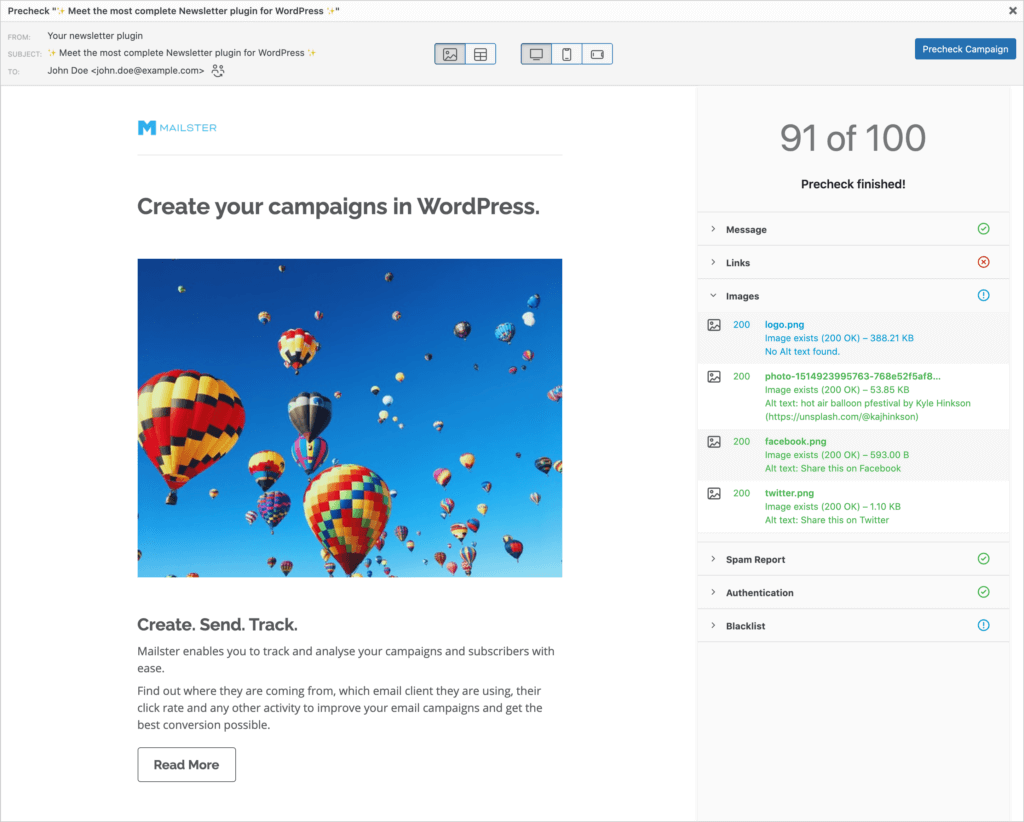
Some people like to use a preview pane to see if your content is worth reviewing. When they take that step, the images are blocked from view.
When the majority of your email message is in graphic form, the preview pane works against your efforts. Someone might see most of the note blocked, which means they’ll shrug and move to the following one.
The critical information of each email must be above the fold to have the preview pane work to your advantage. It is also helpful to have a call to action placed there, but you don’t want to overdo it.
That’s because a call to action at the bottom of the message is often more effective for people who click your email to read it.
Since this issue can lead to some uncertainty, it is often helpful to create customer segments that involve this info. You’ll have a better idea of how to structure your messaging for a successful outcome.
6. Review your preheader text for optimization opportunities.
More than half of today’s email opens come from a mobile device. That means your preheader text needs to support your subject line. That combination gives people another reason to click on your offer.
The preheader text is the information that follows the subject line when previewing an email. It should be at least 40 characters long, but you don’t want to go over 130 to ensure it is viewable on desktops, tablets, and smartphones.

Try to keep your important points at the beginning of the preheader to text to ensure people know what you mean if your message gets cut off for some reason.
Writing a good preheader text is a lot like creating a subtitle for a book. You want to expand on the subject line’s thought while staying consistent with the value you hope to offer.
Think about the title of this content. We could make “How to Nail the Key Elements of an Email Campaign” the subject line. For the preheader text, we could say, “From segmenting to subject lines, here are some great tips!”
7. Think about when you’re sending the email to each customer segment.
People typically get emails out of the way during the first or last hour of their working day. If you’re working with B2B customers, that means you’d want to target recipients between 8-9 AM or 4-5 PM in their local time zone.
If you’re in the eastern United States, that means you’d schedule an email for someone in San Francisco at 11 AM. When you want to reverse that messaging, the California business would need to send out the note at 5 AM.
Time zone awareness is a significant barrier to consider as the world becomes more connected each year. If your clients are half a world away, you must account for the differences. People won’t open a lot of marketing emails at 12 AM!
When you schedule your messages, it helps to review the customer information in your database to ensure accuracy.
It helps to segment your times to ensure each area receives an appropriate message at the optimal moment.
You’ll also want to consider cultural variations when sending market emails. When you target people in the Americas, the general preference is to read messages later in the afternoon. In Asia and Oceania, they prefer a morning contact.

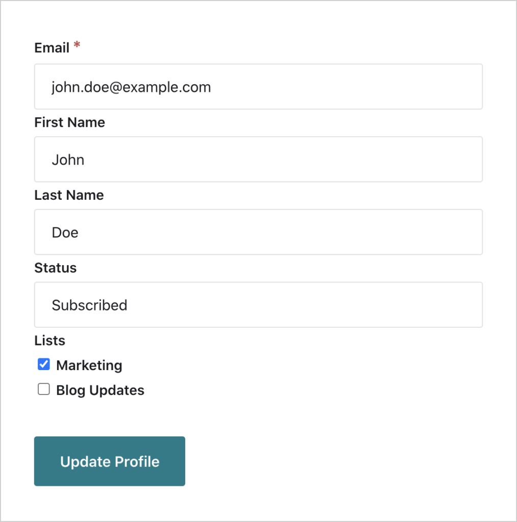
8. Allow people to manage their subscriptions.
One of the biggest reasons people unsubscribe from an email list they find valuable is the lack of control over the contacts. An overwhelming or underwhelming experience can lead to attrition, even if your content has value.
Having a preference center as a landing page on your website allows people to change their preferences at their convenience. You can even let them unsubscribe there.
9. Track your email marketing efforts.
If you’re not using UTM codes with your emails, you’re missing out on tracking post-click engagement from your marketing investment. Although some providers generate this data automatically, you should never assume it’s included.
Consistent UTM codes on every email link let you see if subscribers are converting because of your marketing investment. It also enables you to view what pages they visit and if they’re leaving right away.
Once that information becomes available, you must start testing everything. That includes your featured content, send times, subject lines, and any other variables.
When testing variables, it’s crucial to keep the differences subtle. That allows you to figure out what the differences are in your metrics.
- If you’re trying to boost an open rate, you might send the same email with two unique subject lines.
- Switching the position of your call-to-action button can let you test click-through rates.
- Slight changes in content, such as a product description, can adjust the value proposition that people see to test clicks, engagement, and other data.
The final task is to continue updating and cleansing your email list. When you maintain the information, engagement rates are typically higher than what older or more neglected ones deliver. If someone hasn’t engaged in a long time, remove the address. That starts the customer segmenting process again, letting you start over with this list on your subsequent emails!


