Almost every website can benefit from an email list. If you have a blog, an email list enables you to reach out to subscribers and share your latest and best posts. If you’re running an online store, you can use an email list to send offers and recommend products. As long as your email list keeps growing, the benefits that you get from it will increase accordingly.
Building an email list is easy enough using WordPress. With plugins such as Mailster, you can even automate some campaigns. If you combine a powerful mailing plugin with strategies to help you grow your email list, you’ll reap the benefits for a long time to come.
In this article, we’re going to go over what email lists are and how you can build yours. Then we’ll discuss six techniques to help you grow your email list. Let’s get to it!
What Is An Email List? (And Why Do You Need One?)
An email list is a collection of contacts that you can collect using your website. Mailing plugins and email marketing platforms help you put together that list, and send messages (called ‘campaigns’) to your subscribers.
Traditionally, if you want to use your website to build an email list, you’ll need to add a signup form to it:
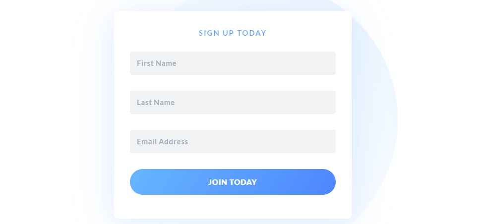
An email signup form is a simple element that asks website visitors to leave their contact information and to confirm that they want to join your list. Once a user signs up, they become a subscriber and give you the green light to contact them via email.
Out of the box, WordPress is capable of sending transactional emails. Those are the types of messages you get when you make a purchase or sign up for a website:
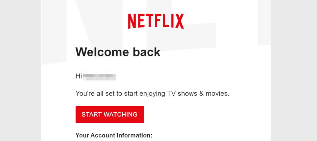
It’s important to understand that WordPress doesn’t use your email list to send these types of emails. These are automated messages that WordPress can send to registered users. However, if you want to send marketing campaigns or more personalized emails, you’ll need an email list.
With an email list, the possibilities are nearly endless. You can send subscribers emails to let them know about new blog posts, discuss changes to your website, and promote new offers. You can even create welcome campaigns spanning multiple emails that let new subscribers know more about you:
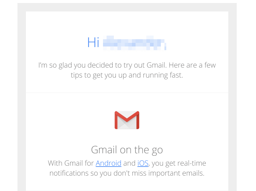
Another way to think about your email list is as a collection of leads. By and large, if someone signs up for your list, chances are they’re interested in what you have to say or offer. You own all of the information in that list, and you can leverage it in any way you see fit.

Start growing your own email list today.
How to Grow Your Email List With WordPress
As we mentioned before, plugins such as Mailster make it relatively simple to set up an email list. The real trick lies in growing that list to the point where it becomes one of your best sources for conversions (if not the top one). Let’s go over some tips for making that possible.
1. Place Your Email Signup Form Somewhere That’s Visible
If you want your email list to grow, you’ll need signups. That means convincing as many visitors as possible to share their contact information via a signup form, and to confirm that they want to receive your emails.
It’s important to understand that not everyone will want to sign up for your email list. As a rule of thumb, a conversion rate that falls between 2-5% is considered pretty good. That means if you can convince two to five visitors out of every hundred to sign up, you’re off to a fantastic start.
There are several ways to encourage visitors to sign up for your list. However, the first thing you need to worry about is where to place your email signup form. The more visible that form is, the better that your results should be:

In our experience, some of the best locations to place an email signup form include:
- Sidebars
- Footers
- At the end of blog posts
- Within the main body of your home page
- Within pop ups
There are pros and cons to each of these approaches. Sidebars and footers tend to work well, since a lot of users expect to find signup forms there. However, if you place your form below the rest of your content, you run the risk of users leaving the page before they get to it.
To sidestep that problem, a lot of websites opt for more aggressive tactics, such as using pop ups that appear after you’ve been on a page for a while or when you’re trying to leave:
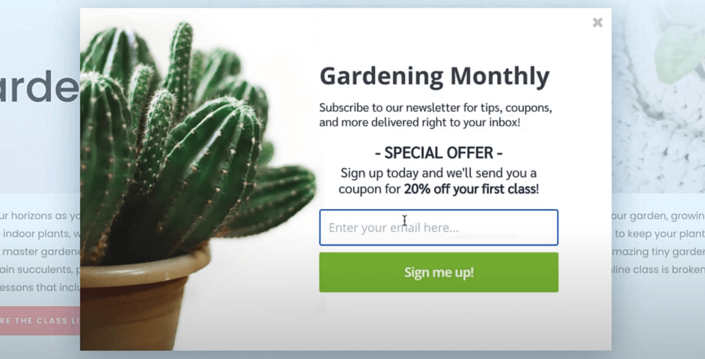
There’s no single placement formula that will guarantee you the most new subscribers. As long as your email signup form is easy to find and stands out visually, you should see good conversion rates. If you’re not getting the numbers you want, then it’s time to experiment with different placements.
2. Use Incentives to Grow Your List
A lot of websites offer visitors incentives to join their email lists. You might, for example, offer users a free e-book or a one-off discount code if they share their emails with you. As you can imagine, this tactic can be highly effective, as you’re offering an immediate reward for a very simple action.
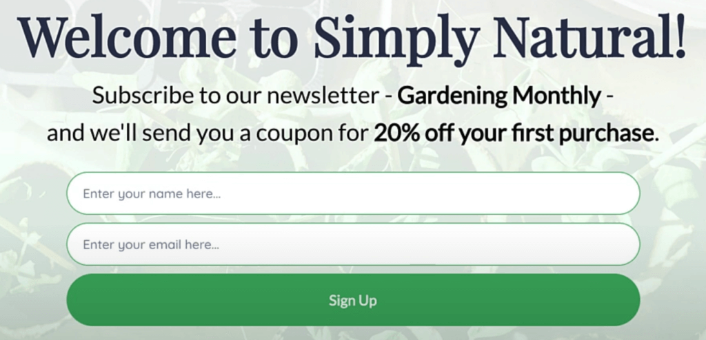
The downside to using incentives to convince users to join your list is that not all of those new subscribers might engage with your messages. As you might imagine, some users will simply sign up to get a reward, and then they’ll ignore your messages or unsubscribe.
Simply put, there’s no way to avoid the fact that some subscribers might not want to engage with your emails. Your primary goal should always be to make your campaigns as engaging and interesting as possible, so you get subscribers to:
- Open your emails
- Take a moment to read their content
- Convert by clicking on links to your website or otherwise accepting your offer
Sometimes, offering incentives to new subscribers works best if the offer isn’t that attractive. If you offer new subscribers an ebook, for example, you can be certain that they’re interested in your content. However, if you offer a 30% discount on a purchase in exchange for an email, you’re going to get a lot of ‘fly-by’ subscribers.
If you’re unsure what you can offer new subscribers, the best thing you can do is to experiment. Try out different approaches and see which ones get you the most new subscribers, and check out how many of those users are engaging with your emails.
3. Simplify Your Email Signup Form
The more complex or longer a form is, the less likely users are to fill it out. Let’s say, for example, that you want to ask new subscribers for their first and last names along with their addresses. Those are just two additional data points, but a lot of users might see that and think it’s too much of a hassle.
You’ll also have users that are concerned about their privacy. While they might be comfortable sharing an email address, they might not want to include their full names or other identifying information.
If you look around your favorite websites, we’re willing to bet that most of them simply ask for an email in their signup forms:
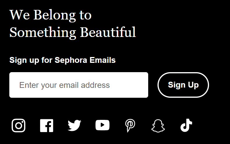
Having a “short” form doesn’t necessarily mean that it needs to be boring, though. Ideally, you’ll add a Call-to-Action (CTA) before the form that encourages users to sign up. That copy should make it clear what benefits subscribers get – otherwise, no one is going to be excited about joining your list.
4. Improve Your Email Signup Buttons and Input Text
Most email signup forms include an input field and a signup button. Users type their emails into the field and then click on the button. It’s a simple process that most users don’t need help with. However, experimenting with the copy and style of your button and input fields can make your signup forms a lot more attractive.
To illustrate that fact, here’s a quick example of what your email signup forms shouldn’t look like:

Boring forms tell visitors that you don’t really care if they sign up for your email list. In our experience, if you fill out a form like that, you can expect to receive a lot of generic emails that you might not even care about opening.
As we mentioned before, email signup forms need to stand out. Great placement alone won’t be enough – your forms need buttons and input text that make visitors stop and take a moment to check your offer:
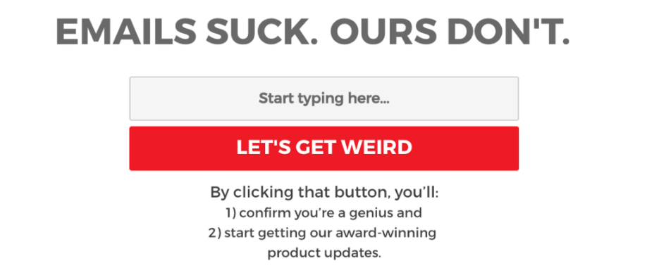
We’re not saying you should go overboard when it comes to design. Signup forms should be stylish, but in most cases, they’re not the main element on the page. To make yours stand out, we recommend that you:
- Use colors that pop visually for your signup button
- Add input text that describes what visitors should do in the email field
- Add some copy and a CTA before or after the form to encourage users to sign up
The tone and style of your forms should match the rest of your website. If you’re going for a fun vibe, you can try something similar to that last screenshot. However, if you’re going for a more professional vibe, you’ll probably want to experiment with a different approach.
5. Create a Landing Page for Your Email List
One common thread with email signup forms is that, in most cases, they’re not the core element in whichever page they’re on. If you have a signup form on a blog post, for example, the form itself isn’t the center of attention – it’s the content.
Think about every page on your website as having a unique goal. With a shop page, you want users to click on a product. If someone visits the Contact Us page on your site, you want them to use that form to reach out to you. With that in mind, there’s nothing stopping you from building a landing page with the sole intent of collecting email leads and subscribers.
One way to do that is to create a landing page with an offer. For example, you can offer users a free consultation in exchange for their contact information:
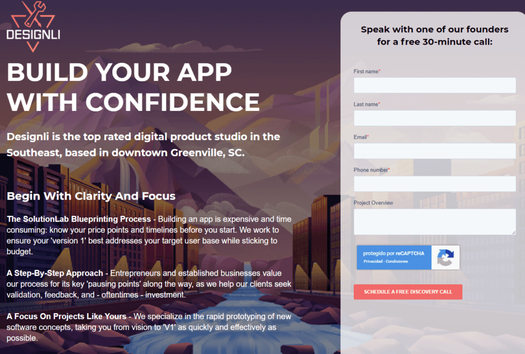
Ultimately, a good landing page tells you why you should care about a product or a service, and it gets you hooked on that idea. When users make their way through your landing page they should think “I want to learn more about this”. That’s where you come in with a prompt for them to leave their email addresses.
In this case, sharing their email is the conversion. Once you have it, you can add it to your list and use it to reach out to them with any campaign you want. For the best possible results, we recommend that you link to this landing page from your website’s main menu.
6. Pay Attention to Email Analytics
So far, we’ve talked a lot about how to collect emails and grow your list. However, growing your list isn’t just about getting the most email addresses. You also have to worry about how well your emails are performing for existing subscribers, or you run the risk of losing them.
If you want to know how well your emails are doing, you need to pay attention to analytics. Most modern email marketing tools (including Mailster) offer you access to data such as:
- Open rates. This refers to how many subscribers actually open your emails when they hit their inboxes. A low rate may mean that your titles and email descriptions aren’t interesting enough.
- Click rates. Once a subscriber opens your email, you want them to click on key elements that will send them to your website or another destination. A low click rate means your emails may not be engaging or convincing enough.
- Bounce rates. If a subscriber opens your emails and then closes them right away, that’s called a ‘bounce’. Generally speaking, it means that your emails might not look interesting, or they might show errors when displaying.
Paying attention to the numbers might not sound glamorous, but it’s the only way to truly know if your campaigns are performing as they should. Depending on what email marketing tool you use, you’ll probably get access to historic data. That will enable you to track your emails’ performance over time, and see how the changes you make reflect in your campaign’s engagement.
Conclusion
Building an email list isn’t as simple as putting up a signup form on your WordPress website and calling it a day. If you do that, you might get an email or two occasionally, but your list will never reach its full potential.
To grow your email list, you need to optimize your signup form and make sure that visitors know why they should subscribe. If you can sell users on the value of joining your email list, you’ll be able to collect hundreds or maybe even thousands of addresses that you can reach out to at any time.
Do you have any questions about how to build your email list? Let’s talk about them in the comments section below!


